Aurelia Materialize Bridge works with MaterializeCSS 2
These workarounds enable you to use Aurelia Materialize Bridge (AMB) with MaterializeCSS 2.x, leveraging its new color system derived from Material Design M3.
Demo
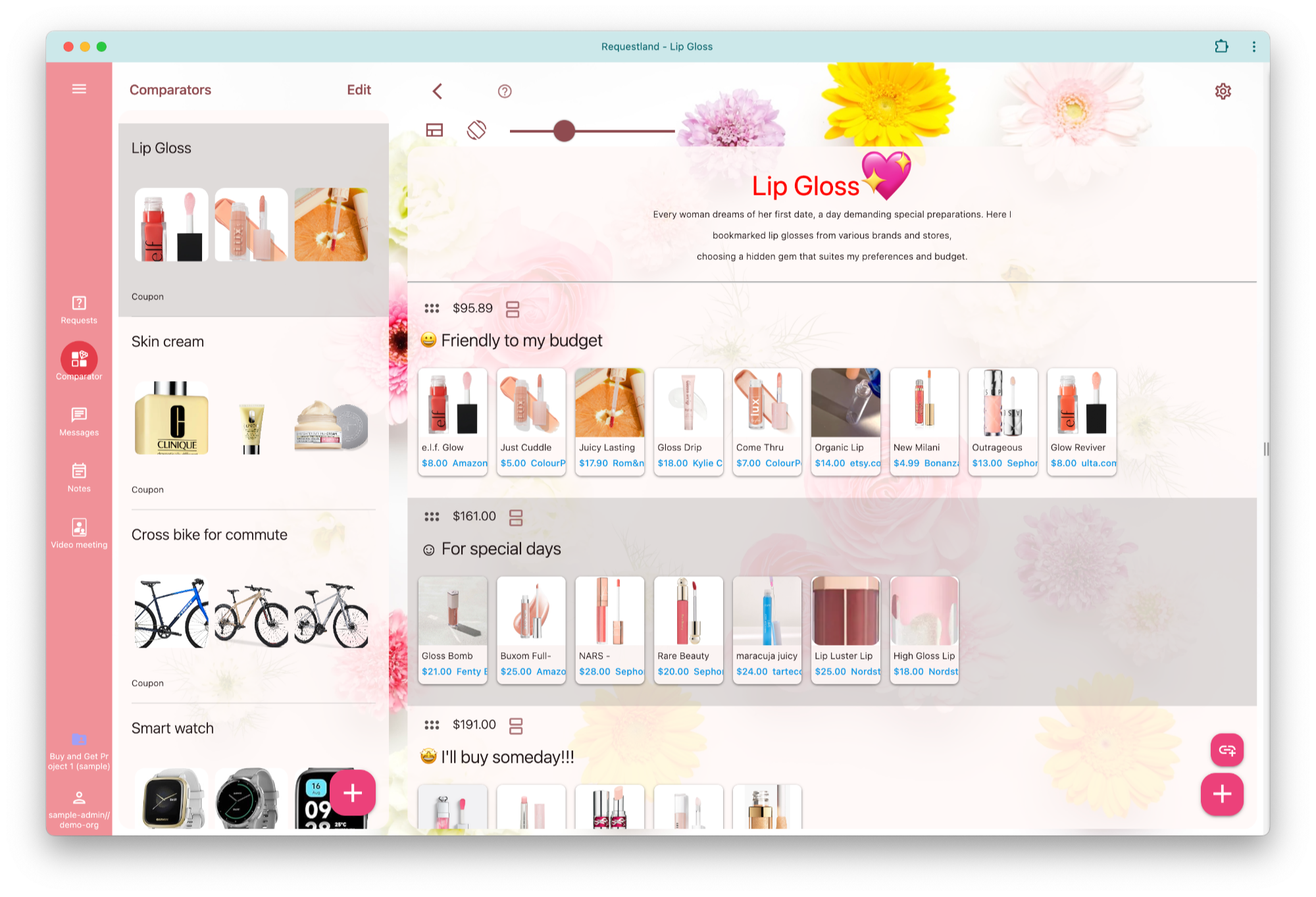
You can check out the theming page of Requestland. I spent several days integrating our theming system with the new color system introduced in Material Design M3.

I also wrote an article on dark mode and another on theming, incorporating the workarounds described below.
Why Upgrade to MaterializeCSS 2?
MaterializeCSS has transitioned to new developers and is evolving to incorporate the latest Material Design 3 (M3) guidelines. MaterializeCSS 2.1 and newer introduces features aligned with M3, such as rounded and tonal buttons.
One of the standout features of MaterializeCSS 2.x is its revamped color system, powered by Google’s Material Color Utilities (MCU). MCU generates a wide range of colors from a single seed color for both light and dark modes. MaterializeCSS applies these colors as CSS variables like --md-sys-color-primary and --md-sys-color-background to the <html> root element.
Aurelia Materialize Bridge (AMB) serves as an efficient connector between the Aurelia framework and MaterializeCSS. However, AMB remains at the MaterializeCSS 1 level and has not been updated for several years.
In this article, I’ll share the workarounds I developed after spending weeks making AMB compatible with MaterializeCSS 2.x. Some workarounds are for AMB and others are for MaterializeCSS 2.x itself.
Workarounds for Using AMB with MaterializeCSS 2.x
Browse new styles
Browse the file node_modules/@materializecss/materialize/dist/css/materialize.css to review the new default colors. If you face any conflicts with changed CSS classes introduced in MaterializeCSS 2, investigate the file.
Add global references in main.ts
To bridge compatibility, include the following code in your main.ts:
import * as Materializecss from '@materializecss/materialize';
import * as AMB from 'aurelia-materialize-bridge';

global.M = Materializecss; // Export MaterializeCSS
window['Waves'] = Materializecss.Waves;
Materializecss.Waves['attach'] = () => {};
global.M.textareaAutoResize = Materializecss.Forms.textareaAutoResize;
global.M.updateTextFields = () => {};
Toast
Replace M.toast() with 'new M.Toast()'. This is a workaround of this issue.
Update md-button attributes
For md-button="flat: false;", include .filled, .outlined, or .tonal.
For md-button="flat: true;", use .text.
If you don't mind the colors changing, these are unnecessary.
<button md-button="flat: false" class="filled">Hi</button>
<button md-button="flat: true" class="text">Hi</button>
<a md-button="flat: false" class="filled">Hi</a>
<a md-button="flat: true" class="text">Hi</a>
Fix <label> in md-select
MaterializeCSS 2.x introduces its own <label> styling, conflicting with <label class="md-select-label"> added by AMB. Add the following adjustment:
.input-field .md-select-label {
    top: 0px;
    transform: scale(0.75);
}
Handle label lifting for <md-input> and <input>
MaterializeCSS 2.x requires a placeholder=" " (not "") to properly lift labels. Make sure to include this placeholder attribute.
Enable md-char-counter functionality
The md-char-counter requires a maxlength attribute to function. Here’s an example:
<md-input label="Name"
          placeholder=" "
          maxlength.bind="100"
          md-char-counter="100">
</md-input>
Remove bullet of ul
  ul:not(.browser-default) {
      list-style-type: none;
  }
Add div to .collapsible-body
<div class="collapsible-body">
   <div>
     text
   </div>
</div>
Fix range (slider)
input[type=range]::-webkit-slider-runnable-track {
    background-color: var(--md-sys-color-primary);
}
input[type=range]::-moz-range-track {
    background-color: var(--md-sys-color-primary);
}
Use the new color system
Just remove <md-colors>.
Conclusion
AMB has a limited theme functionality. Now you can use a complete theming and dark mode with MaterializeCSS. You can see how to implement dark mode in my previous article.
With these adjustments, you can successfully use Aurelia Materialize Bridge alongside MaterializeCSS 2.x, unlocking the powerful features of Material Design 3.